December 2019
A four-person internal working group was formed with the aim of rethinking amiconsult’s range of services: providing the user with a better and visually easy access. After a few weeks of hard focus on the topics, we also started to adjust our mission and vision, thus refining them even further:
- a change of perspectiv regularly,
- a extensive competition analysis and
- many meetings and presentations among each other
It is warm today. A cool breeze carries the scent of the sea to you. The first rays of sunshine warm the sand under your feet. You bury your toes further into the sand, taking a deep sip of your ice-cold cocktail. The earyl surfers silhouette faintly against the slowly rising sun. You hear the soothing sound of the waves. Summer is coming.“ (Excerpt from the tonality sheet of the new corporate identity)
The Shaping (Ductus)
The primary goal of the redesign was to create a consistent style that shows the unity oft the brands. It was particularly important to give the brands enough freedom of design in their form of presentation.
The Font
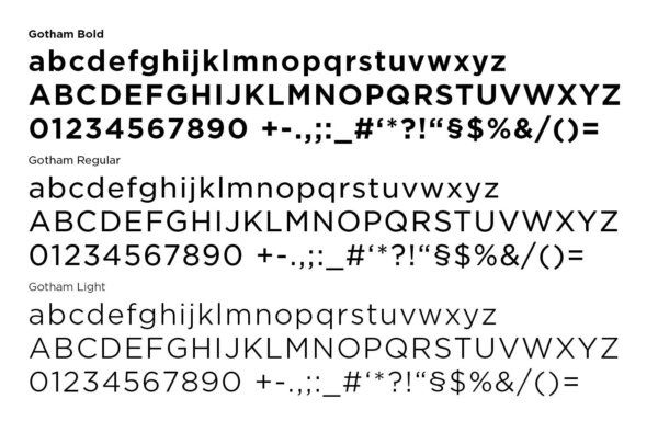
The choice of font fell on the “Gotham” font family. This is a modern, straightforward and therefore very clear sans serif font.
The Figurative Mark
Along with the selection of a new font, the existing logo was adapted. The straightness of the Gotham font made it possible to calm the lines using less aligned ones.
![]()
These two changes underline a more professional and timeless look of the overall identity. But these interventions were only of an aesthetic nature. During our self-reflection, with a constant change of perspective, we developed a new color spectrum based on our mission and vision. Based on our values, we have also developed a new image concept that reflects the joy of life and energy of the employees with more emotion.
We are looking for customers who will stick with us through thick and thin. – We expand our circle of friends day after day. Together we make a change in work and society.“ (Extract from the amiconsult mission)
Through these adjustments, we have succeeded in making our employees identify even better with the amiconsult brand. As a result, we have also managed to increase the number of brand ambassadors for the company. After all, the employees of a company should communicate the most important topics and values to the outside world – simply because they can do it most authentically.
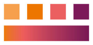
The Colour
We wanted to keep orange as our primary colour. From the perspective of colour perception (colour semiotics), the colour orange stands for:
- openness,
- active expansion and
- creative development.
The spectrum was supplemented by a lilac blackberry shade and a saturated flamingo pink. In a colour gradient these colours create a harmonious overall spectrum and dominate the mood of the overall brand.
The Mood of the Picture
Overriding the mood of the picture, the color spectrum runs through the entire brand. The picture mood itself is divided into two areas:
- the service cocktail and
- the corporate division.
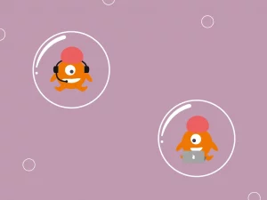
For the service range, we decided to use the organic micro-world as a visual bridge which takes place inside a lava lamp.

For us, the lava lamp represents for example:
- the release of a bubble from the outside mass as a parallel for project sourcing,
- the spectacle that takes place in the middle of the lamp, as a symbol for an Identity & Access Management system,
- a closed system with different users, user groups as well as rights and accesses.
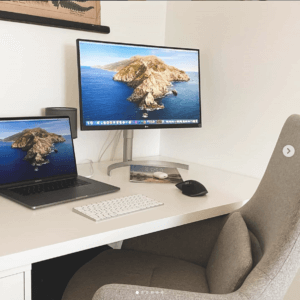
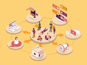
The previous mood of the corporate division lived on the diversity of the images which we wanted to keep. We defined the image style using a Lightroom filter so the images have a unique look that is also highly recognizable.
Roll-Out
As part of the roll-out, we presented the goals, the process and the results of the new design in a short presentation. This was particularly important to us because we consider our employees to be our most valuable asset and an essential part of the company’s external image and communication.
Learnings
Thanks to the digital inventory, the redesign gave us a good overview of all the areas of the company that we looked at both as a whole and individually. This allowed us to identify the points where we can improve. These were communicated as action items in the respective areas. Compared to the previous design, we made a conscious decision to go for something completely new. This change is also connected with a lot of courage to make a decision, as a lot of additional media and channel adjustments and certain investments were necessary. This shortly after the roll-out, it is quite early to draw a representative conclusion. But we are very satisfied with the visual changes of the redesign and we are also very excited about the feedback!